A homepage is like the lobby of your personal office building. When a visitor arrives at an office lobby, we want to do several things, including:
- Make them welcome
- Let them know if they’ve come to the right place
- Let them know how to find what they need once they step inside.
The same goes for our homepage.
Many websites have a chatty homepage with some form of welcome from the writer. Something like: Hello, I’m Lisa. Welcome to my website, where I talk about…
While this approach is certainly welcoming, it’s not ideal. Because although your website URL may be your name, your website is primarily not about YOU, it’s about WHAT YOU OFFER—your products, ministry, and the solutions you provide for web visitors in need of hope, healing, encouragement, and positive entertainment.
Why does this matter?
- Most visitors to your homepage have come looking for something. If they don’t find what they want they’ll try the next address on their search list.
- You have only a few seconds to hook a visitor. If you don’t capture their attention immediately, they’ll move on.
- If you don’t make it clear what your site is about, people who really need what you have to say may not realize it and leave before they get to your wonderful content.
In order to create a homepage that captures the interest of your target audience and guides them to your wonderful content that can help them, consider the following questions:
1. Can a visitor get an inkling of what your site is about in a quick glance at your homepage?
Or do they see nothing but some pretty photos and a bit of vague text? Your tagline, logo, header image, font choices, and other design details all tell visitors something about what kind of site they’ve landed on. Are you giving them a clear message, or do these details obscure the real personality and purpose of your brand and your message?
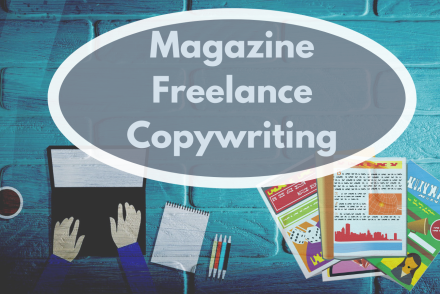
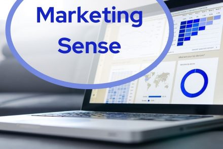
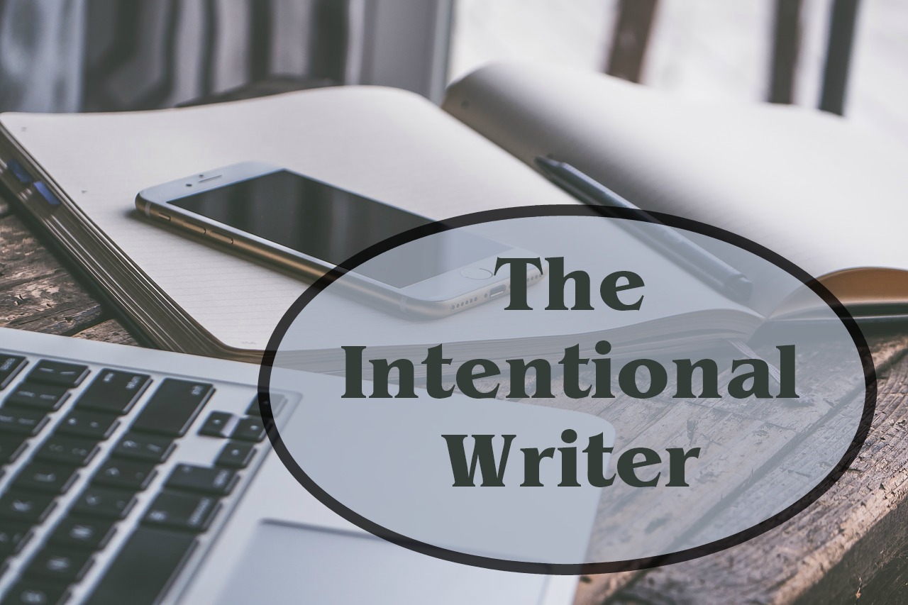
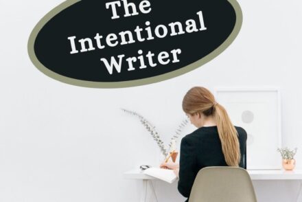
Examples: A quick look at these four very different writer sites gives you a pretty good idea of the kind of thing they write.
Don’t despair if you don’t have the finances to make your site look as awesome as these ones. A simple site design can be just as effective. Do all you can to make design choices that give a clear message about the personality and purpose of your site.
2. Who is this site for?
Who is most likely to need what you have to offer? The more precisely you describe who you are aiming to help, the more likely they are to stay long enough to read what your site is about. Is your target audience young moms? People struggling to lose weight? Sports fans who love mysteries? People who wonder if God still exists? Whoever you write for, make that clear on your homepage.
3. What does my site offer?
People visit the web because they looking for something. They have a problem and they’re looking for a solution. You might have what they’re looking for, but do they know that by looking at your homepage? Do you make it clear what kinds of products and solutions you offer?
The Serious Writer homepage is a good example. The design is quite simple, but one glance at the header tells you exactly what they are about, and the text beside the photo describes who their intended audience is.
4. Is my site easy to read and navigate?
How readable is your text? Flowing script fonts may look beautiful, but they tend to be hard to read. Use them sparingly. Also watch out for small font sizes and insufficient contrast between text and background. The majority of visitors are looking at your site on their phones. If they can’t read your text, your message is worthless.
Likewise, your menu should clearly show where a visitor can click to find that they want. Make sure the commonly sought parts of your page (About, Contact, Books/Products, Blog) are clearly labeled and easy to find.
5. What do I want them to do next?
Someone has come to your homepage. They fit your target audience. They like what you say you can do for them. Great!
Now what?
You could let them click around on the menu to see what’s available, but a great homepage points visitors to your best content with an obvious call to action.
What are the one (or two) primary actions you want them to take?
Do you want them to buy your new book? Sign up for your newsletter? Take your quiz? Try your free webinar?
Guide visitors to that next step with simple text and compelling images.
Your turn
What can you do to improve your homepage? Choose one of the questions above and figure out how you can make your homepage even better.

An engineer-turned-mystery-writer, Lisa E. Betz infuses her novels with authentic characters who thrive on solving tricky problems. Her debut novel, Death and a Crocodile, won several awards, including Golden Scroll Novel of the Year (2021). Her second novel, Fountains and Secrets released January 2022, from Redemption Press.
Lisa combines her love of research with her quirky imagination to bring the world of the early church to life. She and her husband reside outside Philadelphia, Pennsylvania, with Scallywag, their rambunctious cat—the inspiration for Nemesis, resident mischief maker in the Livia Aemilia Mysteries. Lisa sorts book donations at the library, directs church dramas, eats too much chocolate, and experiments with ancient Roman recipes.
In addition to writing novels, Lisa blogs about living with authenticity and purpose. Visit her website: Quietly Unconventional. Or visit her social media: Facebook , Twitter, Instagram, Pinterest, Goodreads.
 We love helping your growing in your writing career.