

I’ve heard it said that a book cover is one of an author’s strongest marketing tools. I think most authors have some level of input on at least some of their covers. Whether the cover is provided by a publisher, purchased ready-made, specially designed by a provider, or a DIY project, it’s a good idea to understand the basics about what an effective book cover looks like so you can make the best use of your level of input.
The cover needs to convince the target reader to stop scrolling and click to learn more. To do this, it must communicate the age group, genre, and tone in an attractive and compelling package, all in mere seconds!
That’s a tall order. The road from story idea to cover design is fraught with pitfalls. I must confess, when I first tackled producing a mockup on my own, I discovered it’s more complicated than I thought.
Imagery and Fonts
I found it surprisingly hard to find the right balance for YA. Artwork and fonts that look too middle-grade can unintentionally signal to older teens that the book is not meant for them. Young adult readers are drawn to stories that take their emotions, struggles, relationships, and faith questions seriously. They want a book, and a cover design, reflecting that maturity level. My first several tries had a too-young feel, and I had to go back to the drawing board.
Other covers may resemble an adult inspirational novel, devotional, or women’s fiction book, and accurately communicate the Christian element but fall short in conveying that the story is meant for teens. My own personal taste isn’t what I ended up with. After realizing what today’s teens prefer, I aimed for that instead.
Nailing the Genre
What genre is it? Non-fiction? Fiction? What kind? YA Christian has many categories, such as contemporary YA romance, YA fantasy, historical, and so on, and each have very different genre expectations. Prospective customers depend on visual clues on the cover to tell them what kind of story is being offered. A book cover is a promise was something I heard a lot. Before the description is read, the cover is already preparing the reader for what to expect in the pages.
For my novels, I studied the successful book covers in my specific target category of YA contemporary, emotional, issues fiction before making design decisions. I looked at the typography, imagery, colors, character presentation, and overall mood. This was not to copy another author’s cover, but to intentionally learn the visual language customers respond to. This way I can better make an informed evaluation. (If an author wants to design their own, a more intensive dive into all of these is undoubtedly beneficial.)
Using Symbols and Story Images
As authors, we naturally feel attached to the details of our stories, such as a special item, place of importance, or motifs. It can be tempting to put those things on the cover so readers will understand the story. Usually, readers won’t realize the significance until finishing the book, so including elements that won’t resonate at first glance can make potential customers scroll by.
Does that mean you can’t use symbolism from your story? Not at all.
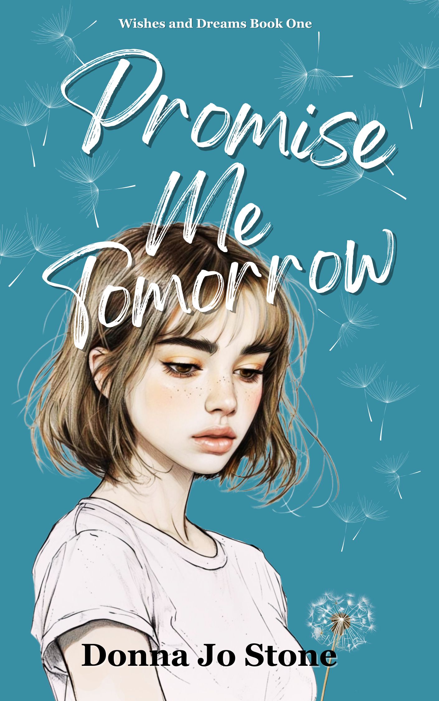
In Promise Me Tomorrow, the first book in the Wishes and Dreams series, dandelions carry significance. But… I designed my mock-up before I ever considered the dandelions in the text, primarily choosing visuals that (hopefully) help set a mood and tone. Dandelions in a wind signifying change that cannot be stopped, a heartfelt wish, fragility, things scattering—to me all of these felt right for a book about grief, change, and hope.
A strong cover creates curiosity rather than explaining the entire plot. A central visual idea can capture the feeling or promise of the story. Let readers discover the rest in the pages.
There is another consideration when using symbols I hadn’t thought of before I looked into this. If a symbol matches the tone perfectly and identifies the genre, yet is so overused that the book disappears into the crowd, the designer may need to be a bit creative. This tends to happen with nonfiction Christian books but sometimes fiction as well.
Love It… or Don’t
After all the work that’s been poured into creating a book, it’s perfectly natural for an author to have strong opinions about how the cover should look. But a cover is a marketing tool meant to connect with readers. It’s not really for the author, and personal favorites, such as colors, fonts, photographs, or design styles may not always be the best choices for your book’s packaging.
This can be hard for writers to accept, especially when they have a specific image in mind, but ultimately, my desire is to reach my target readers and get them to read the novel.
Before approving or finalizing a design, take a moment to imagine a teen who knows nothing about the book and ask, based on the cover alone:
What age group would they think it’s for?
What genre would they expect?
What emotion or mood does it evoke?
Does it look like a book they would actually buy?
Those questions are often more helpful than what an author might like (or dislike) about the design. The goal is to create a cover that feels authentic to the story and is attractive to the reader. Keep that in mind, and you’re ahead of the game.
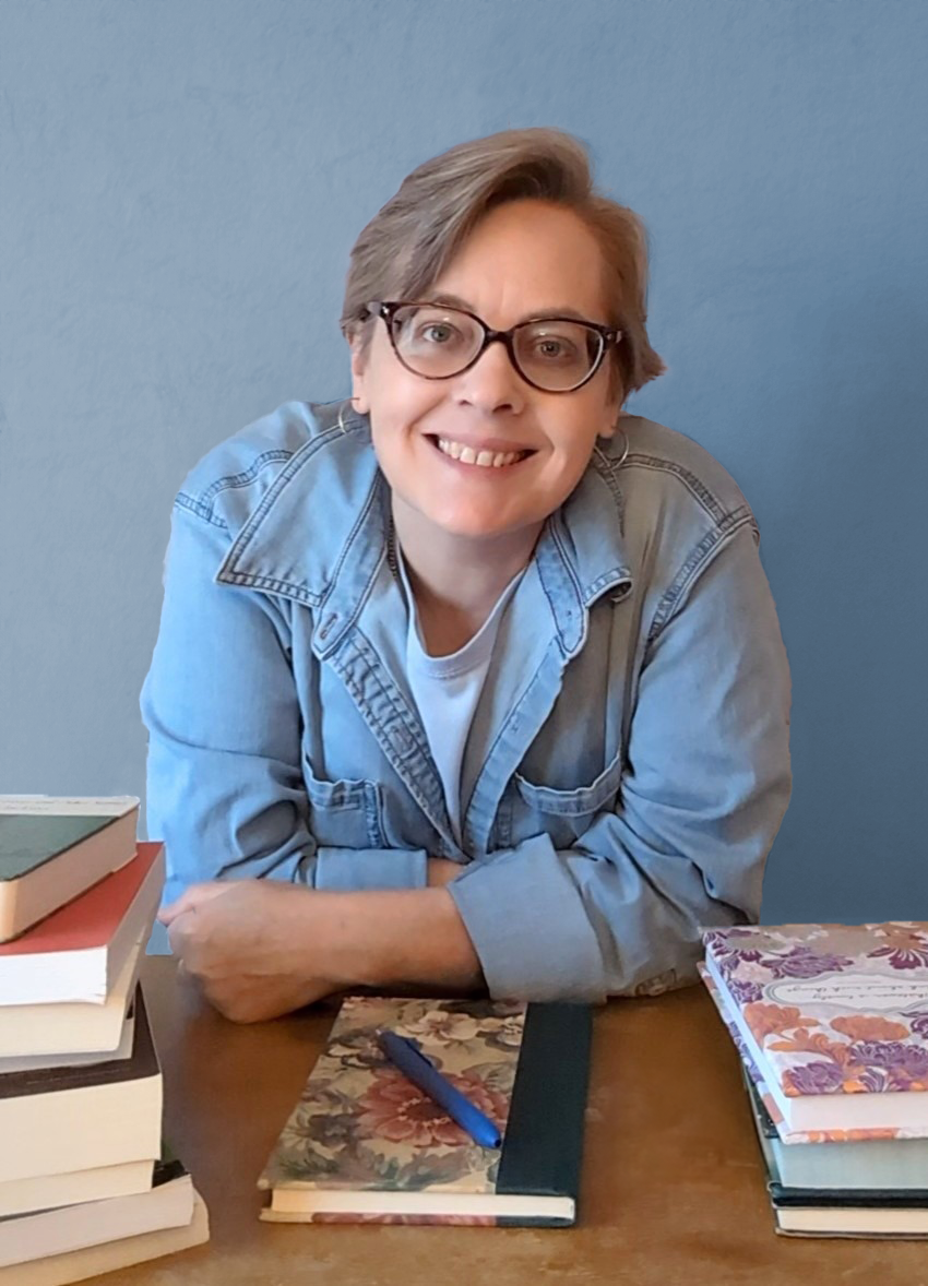
Donna Jo Stone is an award-winning, multi-genre author. She writes contemporary young adult, historical fiction, and southern fiction. Many of her novels are about tough issues, but she always ends her stories on a note of hope. Finding the faith to carry on through hard battles in a common theme in Donna Jo’s books. Her novel When the Wildflowers Bloom Again is a 2025 ACFW Carol Award Winner.
Her contemporary young adult novel and 2025 SCWC Notable Book, Promise Me Tomorrow, is available in ebook, print, and KU. For the latest news on upcoming releases and other author news, sign up for Donna Jo’s newsletter at donnajostone.com.


No Comments